case study / product design
Jamba Juice
How might we improve mobile ordering for busy lives?
Jamba Juice is known for its made-to-order smoothies and on-the-go meals. During this group UX project, I partnered with two other designers to reimagine the mobile ordering experience with a focus on one question:
How might we help healthcare staff with demanding jobs grab a bite to eat and their colleagues without disrupting their demanding schedules?
2
2
2
2
2
2
3
3
3
3
3
3
3
3
3
1
1
1
1
1
1
1
1
1
2
2
2
My Role
This was a team project with 2 other designers. My role included:
- facilitating workshops
- selecting research methods
- user testing
- prototyping
The Challenge
The original prompt was broad: “Improve a food delivery mobile ordering experience.”
We knew we couldn’t fix everything at once, so started by creating an assumptions map to focus our efforts.
Since this project took place during the pandemic, we chose to focus our design for hospital workers—people who need fast, reliable nourishment but have little time to order for themselves, let alone a group.
The Problem
A busy worker needs an efficient way to order menu items for their group of colleagues so they don’t have to deal with the hassle of making sure everyone pays their fiar share or gets the correct order before they need get back to their work duties.
The Solution
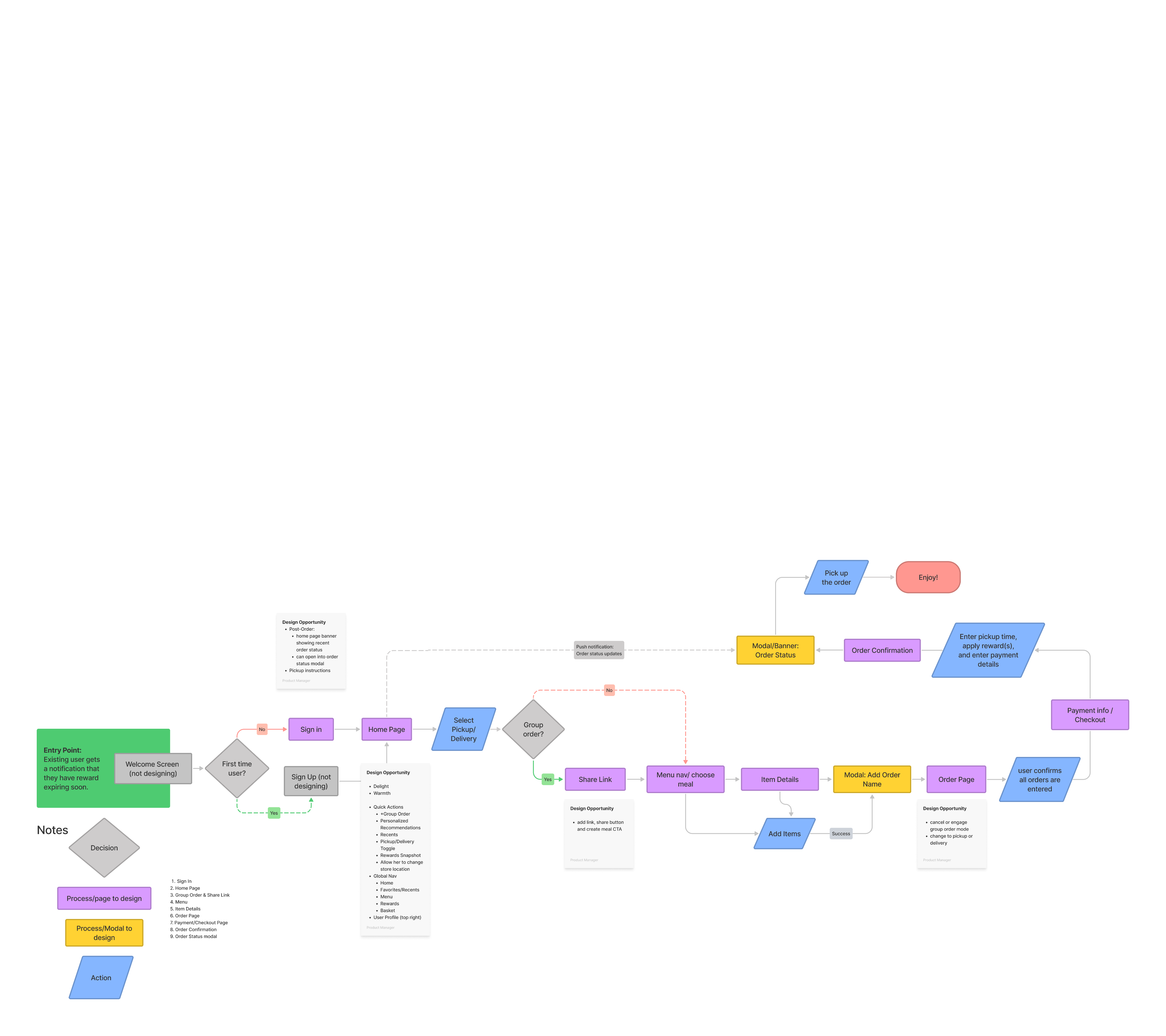
Our solution is to:
- Optimize group ordering by allowing users to collaborate. Each can order, edit, and pay for their portion.
- Include recommendations to speed up their order time
- Improve order status communication
Key Features &
UX Improvements
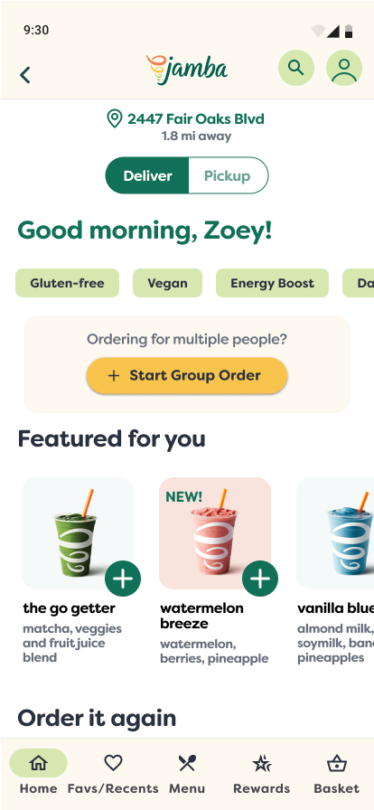
Clearer Menu Access & Personalized Recommendations
Before: users had to tap multiple times just to find the menu and lacked clear guidance on what to order
Now: a swipe-able menu appears on the landing page. Contextual suggestions & reorder buttons reduce decision time.
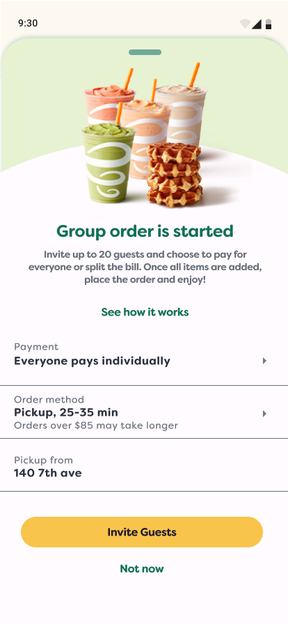
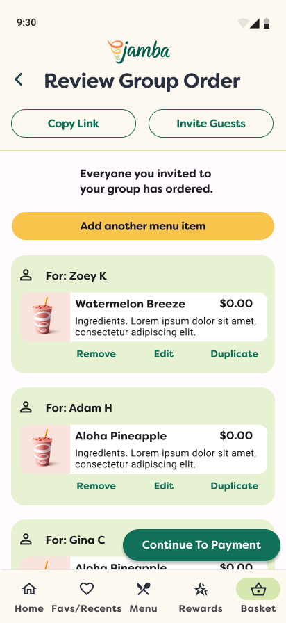
Seamless Group Orders
Before: Hosts coordinated orders with others in their group manually through texts and screenshots.
Now: With the new group ordering feature, users in a group can either check out individually or let the host handle the checkout for the entire group.
In both host and individual checkout modes, the host can share a link for individuals to place their own orders. Additionally, the host can add and label orders on behalf of others.

Real-Time Status Updates
Before: In the previous version, users needed to navigate through various links to locate their order status.
After: A persistet timeline widget shows order progress, with arrival notifications and a “Mark as Here” feature to speed up pickup.
Research & Discovery
We took a multi-method approach to understanding our users and their pain points:
- Desk research & app reviews revealed common frustrations: unclear menus, customization issues, and status uncertainty.
- Contextual inquiries gave us insight into real ordering behavior.
- User interviews helped validate assumptions and surfaced key needs around trust, speed, and group coordination.
To synthesize findings, we used a Value Proposition Canvas, mapping jobs, pains, and gains from functional and emotional perspectives.


Product & Services
- Order item customization
- Trustworthy ratings
- Editing orders
- Store location finder
- Order accuracy
- Show store hours and items available
- Suggested Items


Pain Relievers
- Customize easily
- Transparent ingredients
- Instant support
- Accurate info: hours, menu
- Easier app ordering


Gain Creators
- Live assistance
- Status updates
- Easy to use rewards
- Ability to split bill
- Inclusive dietary options
- Help making choices
- Group order discounts
- Safety measures used

MARKET
FIT


Main Gains:
- Accurate and reliable orders
- Good deals and rewards
- Convenience
- Healthy Choices

Main Pains:
- Long wait times
- Group order issues
- App bugs and reporting
- Missing items

Main Jobs:
- Get clear info and update
- Organized group orders
- Customize orders
- Pickup quickly and safely
Key Insights That Guided Design
I carried out five think-aloud interviews with avid extreme sports enthusiasts. They were tasked with navigating the current Red Bull TV platform while sharing their thoughts out loud.
Here are some key insights gathered during the testing of the current app:
From Ideas To Solutions
We began by mapping a user flow to visualize a simplified experience from browsing to pick-up. Then we built and tested low-fidelity wireframes through three rounds of unmoderated usability testing in Maze.
Some early explorations—like a multi-step group flow—were too complex. Users misunderstood steps or missed key actions. We simplified the flow and added orientation copy to clarify what to do next.