Ana Argüezo
case study / product design
Red Bull TV
How might we help Red Bull sports fans connect with the sports and athletes they love?
Red Bull TV features exclusive content on extreme sports such as mountain biking, surfing, climbing and snowboarding. It’s free, ad-free, and packed with content you can’t find elsewhere. But for fans trying to follow live events or keep up with their favorite athletes, the platform’s navigation makes discovery harder than it should be.
This project explores how to make Red Bull TV easier to navigate, more personalized, and more connected for the fans who crave deeper coverage.

My Role
- Sole UX/UI Designer
- User Interviews & Research
- User Flows
- Wire-framing
- Usability Testing
- Prototyping
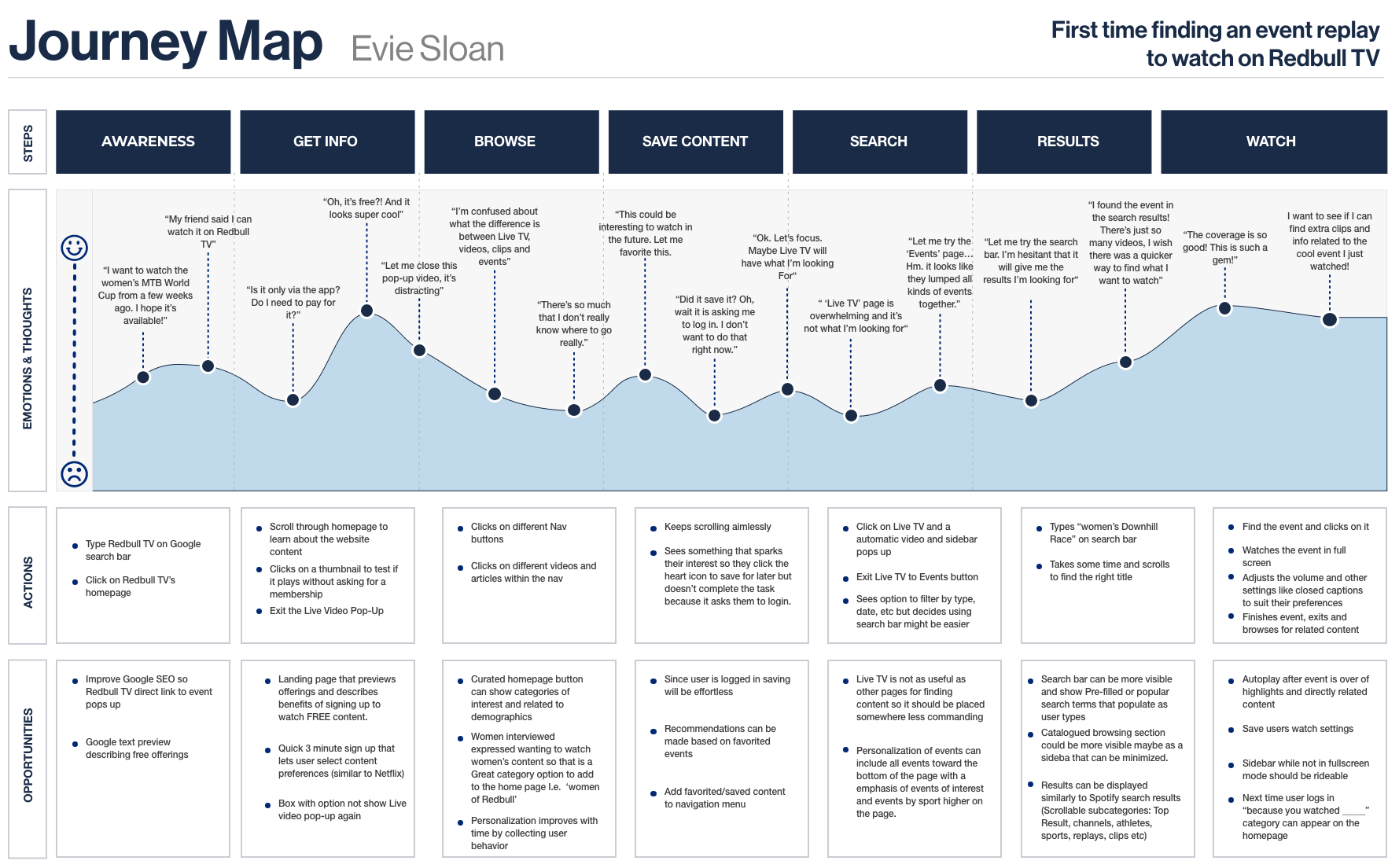
The Problem
How might we help Red Bull sports fans quickly access live events and stay connected with their favorite athletes through content they care about?
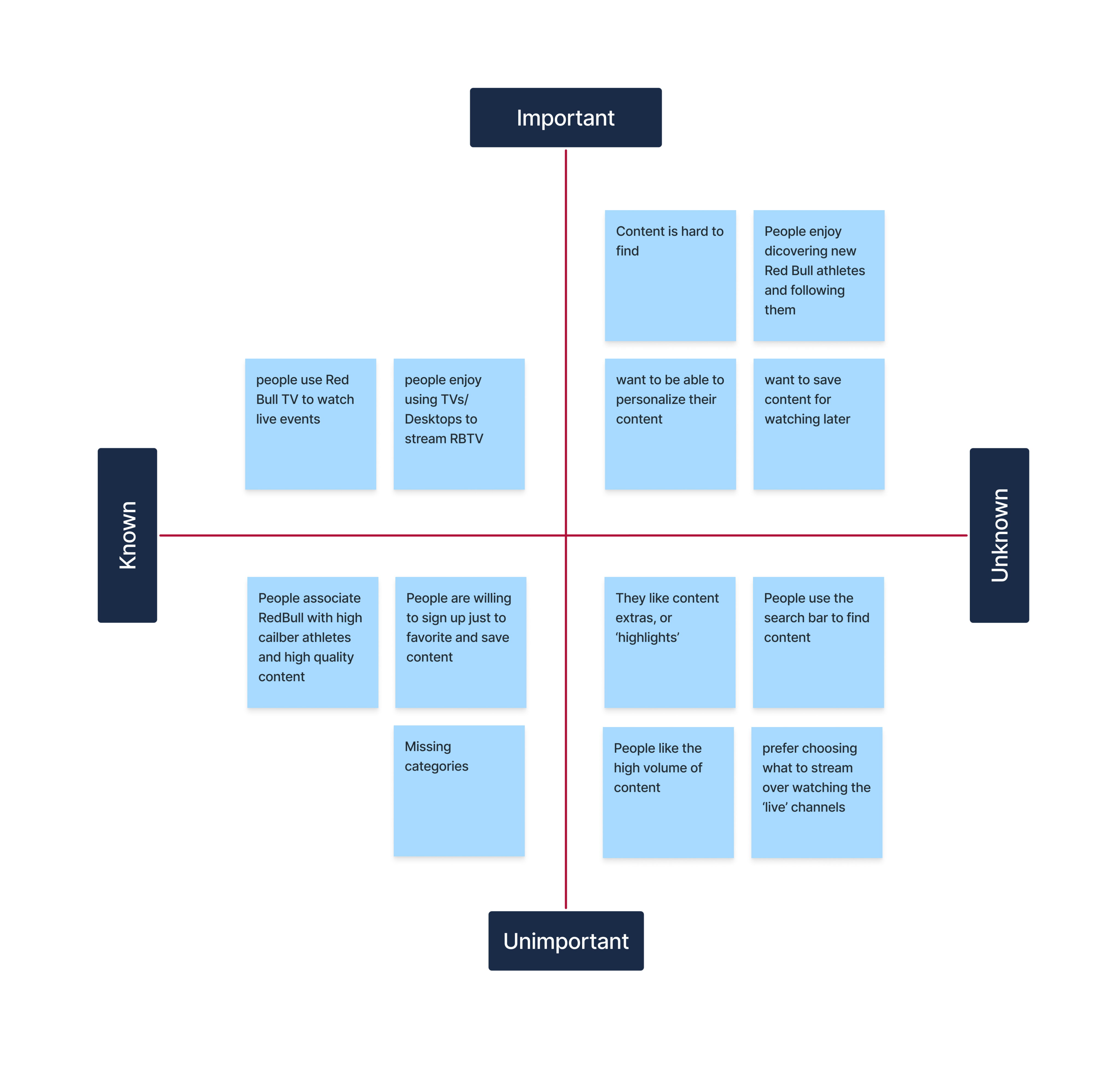
Despite high enthusiasm for Red Bull’s unique content, especially their live events, user interviews revealed that fans:
- Struggled to find what they wanted to watch
- Encountered confusing navigation paths
- Abandoned key tasks like saving favorites due to sign-in friction
- Wanted more athlete-centered content and easier browsing by interest
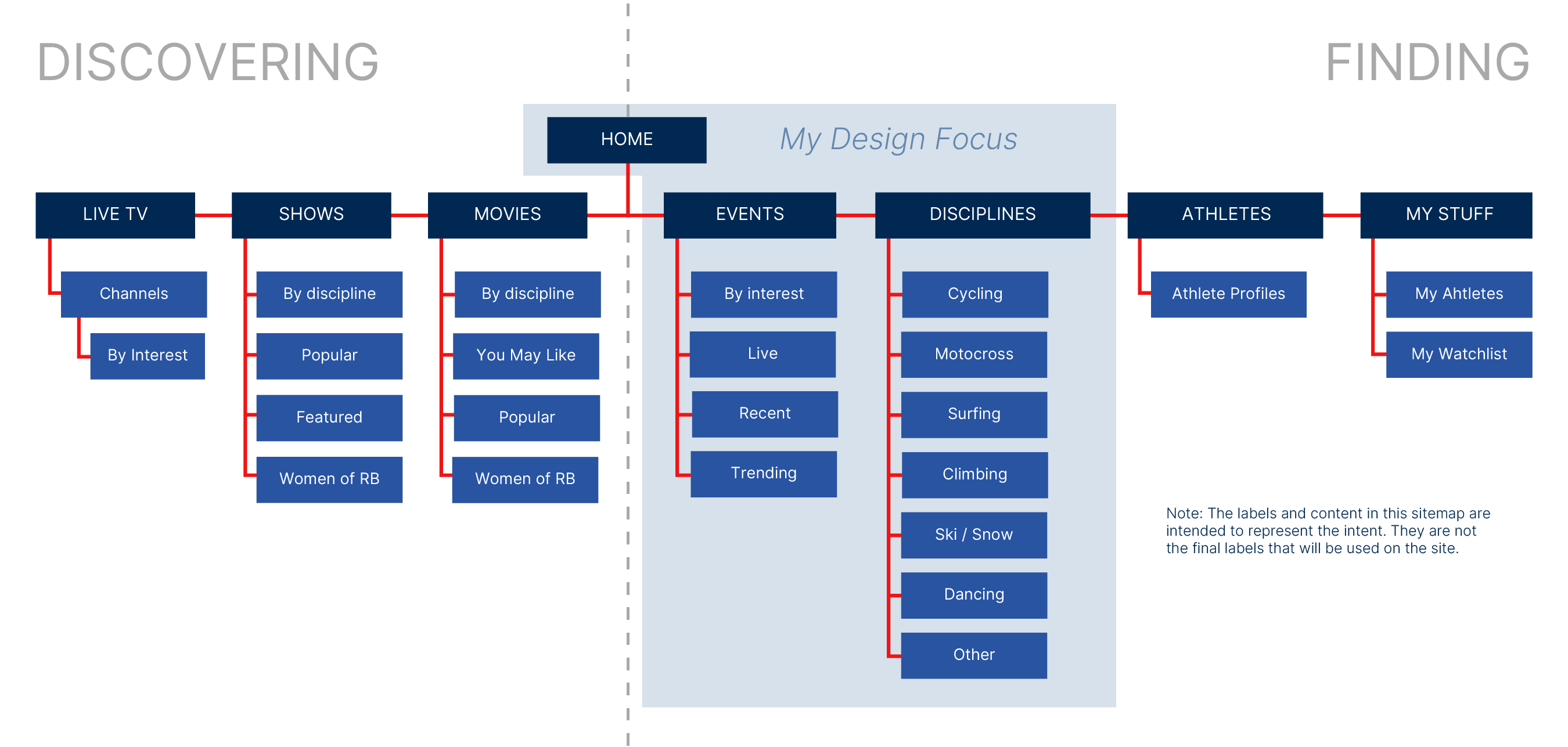
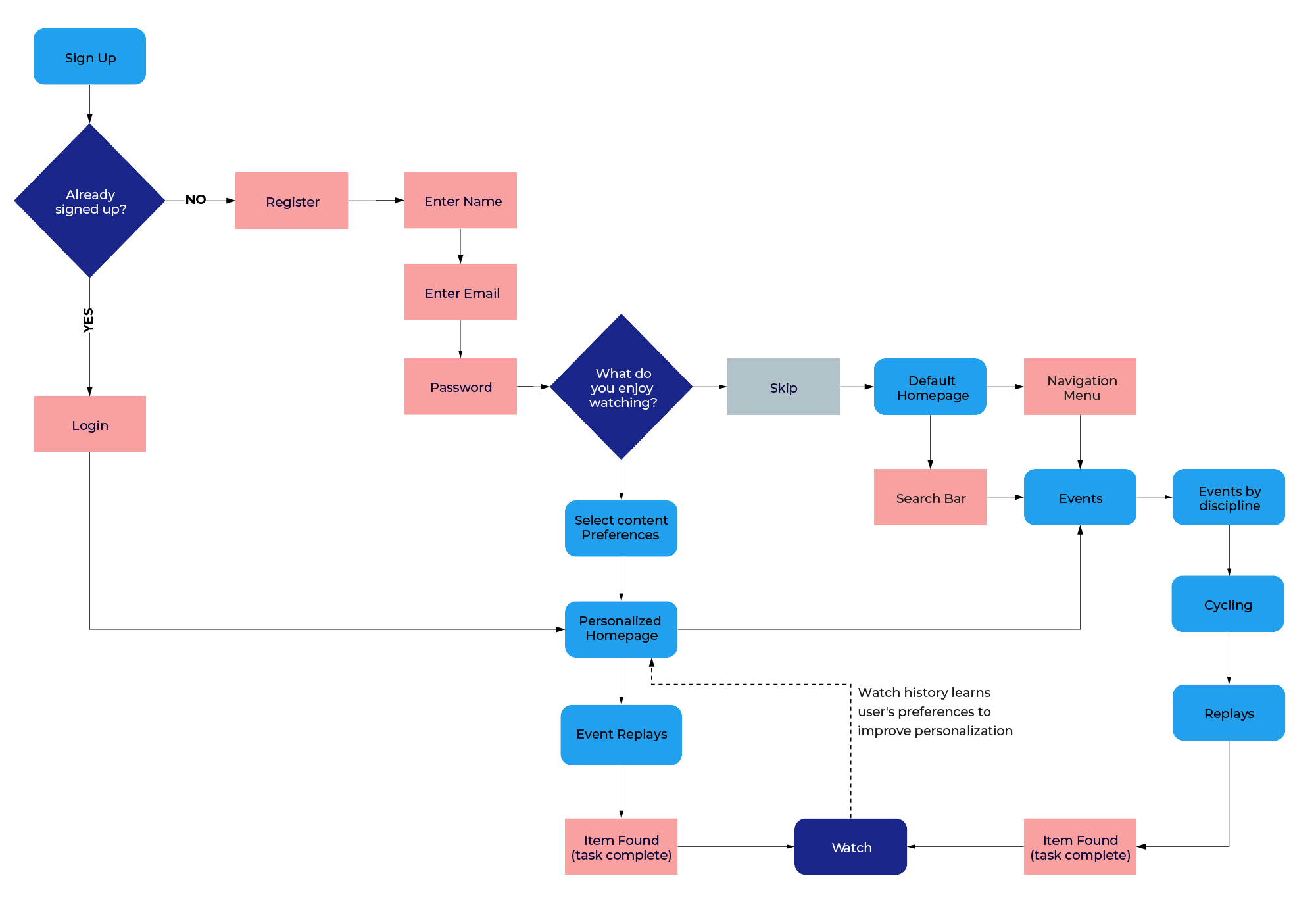
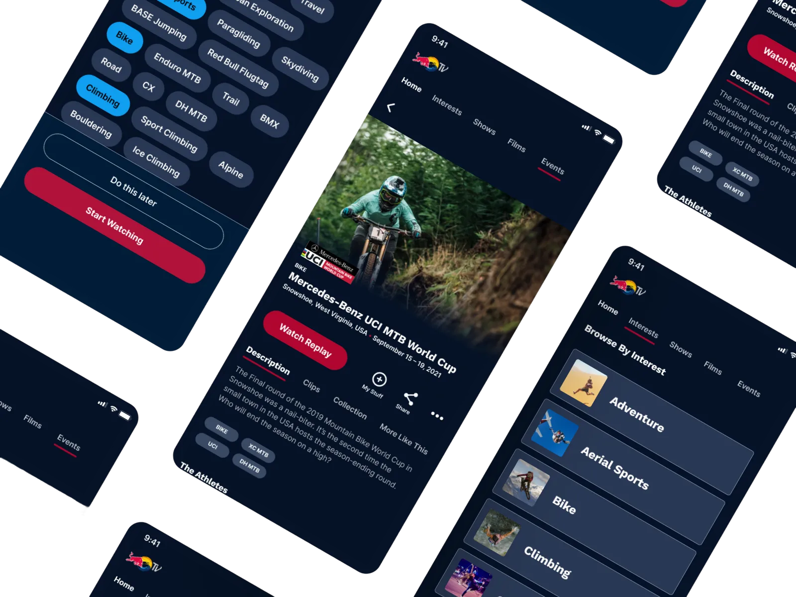
The Solution
This solution enhances the discoverability of relevant content through personalization and by introducing the ability to browse ‘by sport’. Under the sports category the user can quickly find anything related to their sport, including live events. Athlete profiles will now be integrated within the event details page, allowing users to quickly access more information about them.
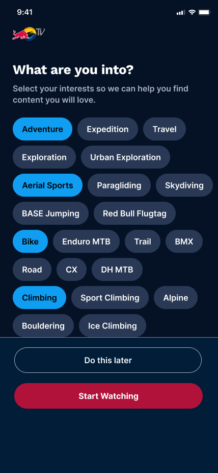
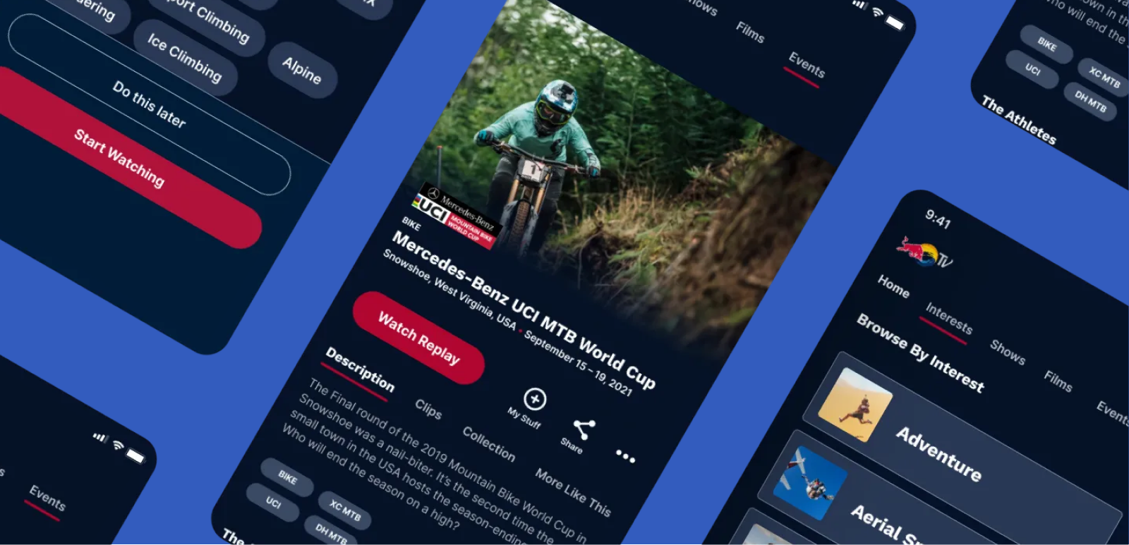
Onboarding Quiz
Signed in users can choose what content they want to see.
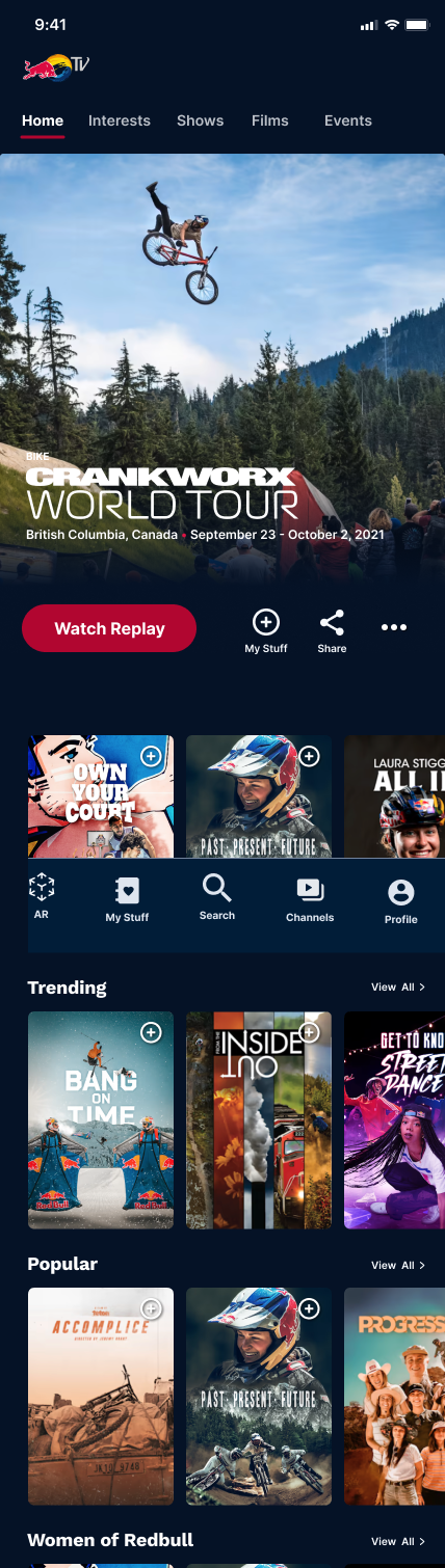
Personalized Homepage
Homepage is tailored making it easier to find relevant content.
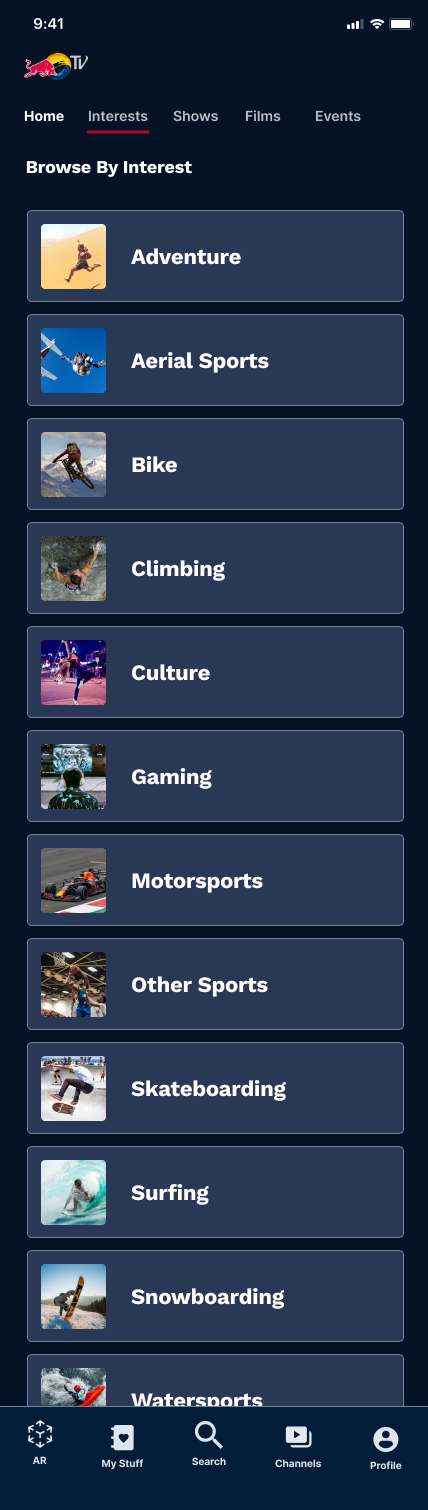
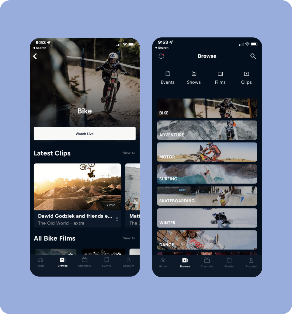
Browsing By Interest
Users can explore sports they love, and dive into upcoming events and content archives.
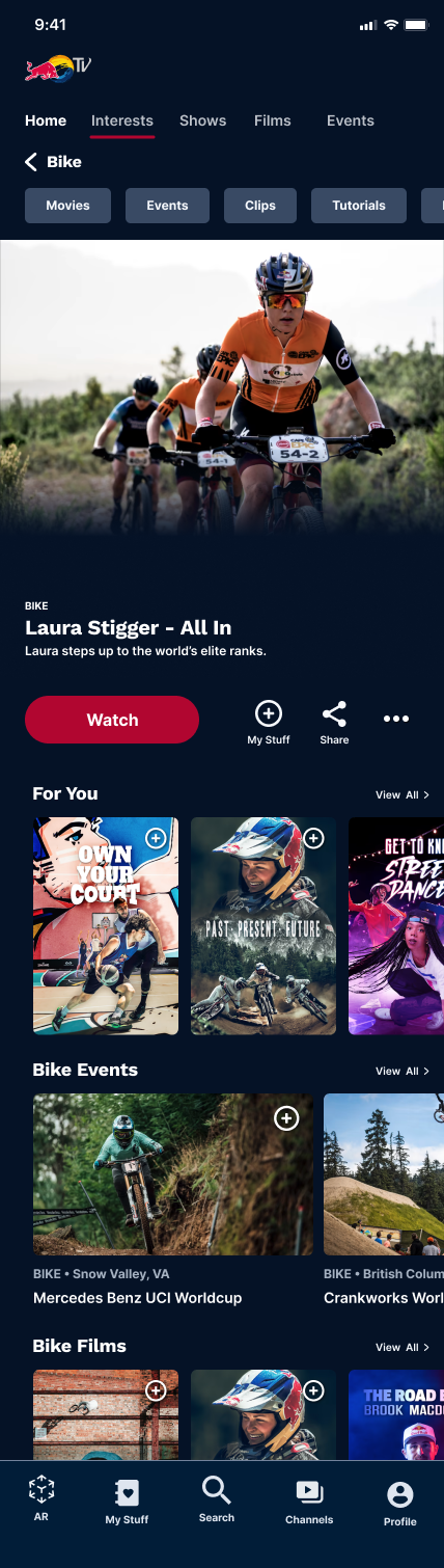
Dedicated Sport Page
Highlight featured athletes so users can learn more about them and get updates.
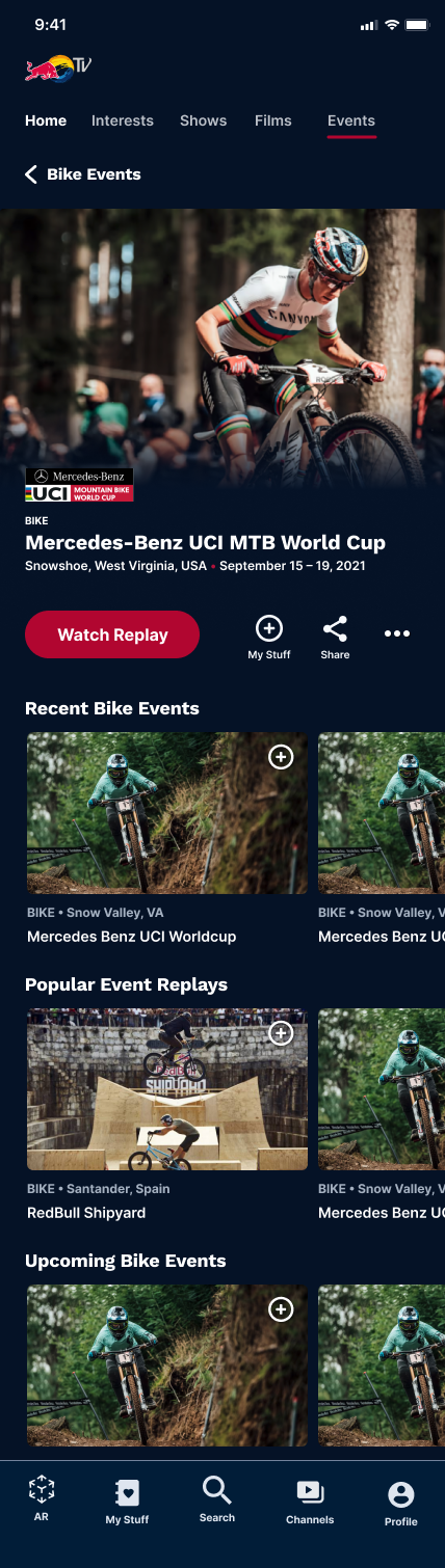
Events by Sport
Highlight featured athletes so users can learn more about them and get updates.
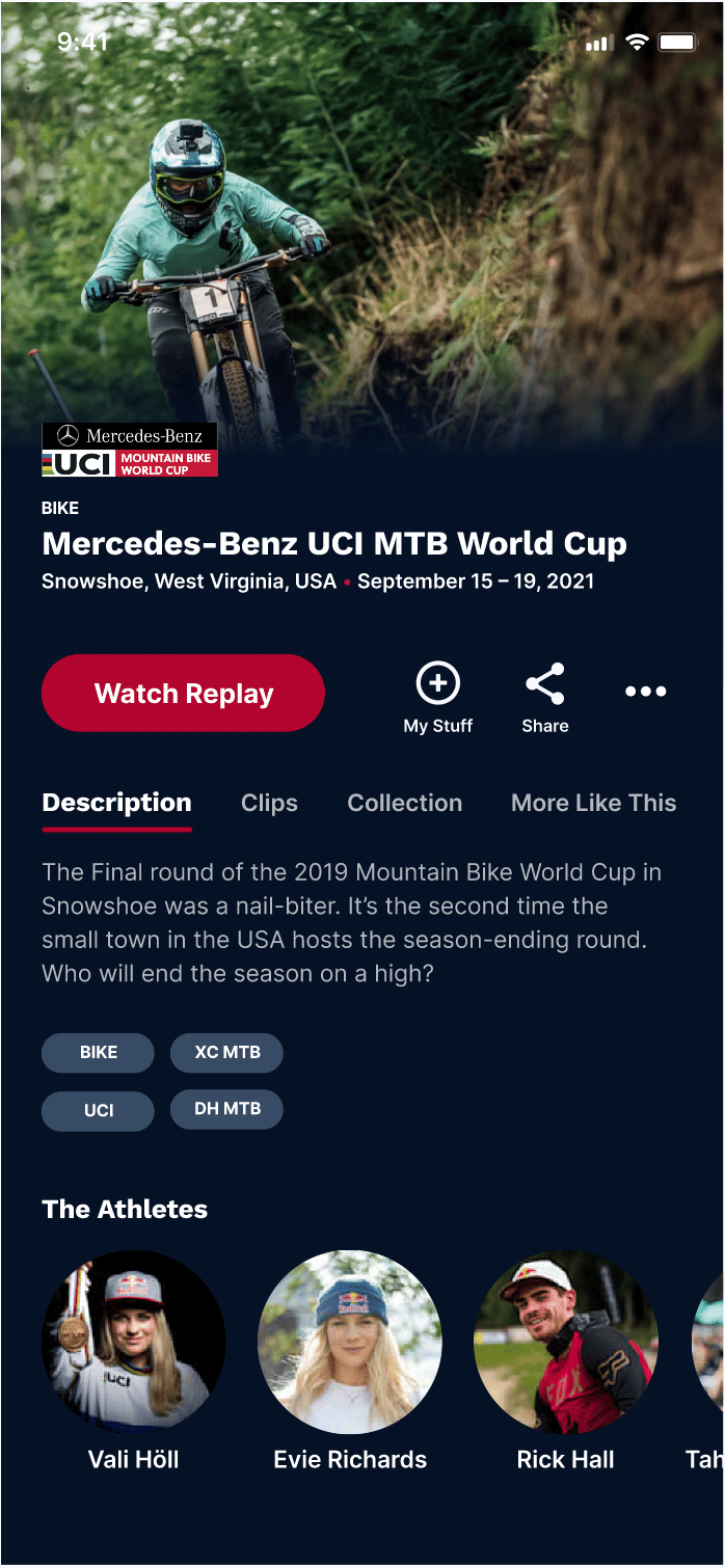
Athlete Profiles in Event Details
Highlight featured athletes so users can learn more about them and get updates.
”Red Bull TV is like when I open my little nieces toy box to find something. You know what you want, but there’s so much in there that sometimes you get distracted with whatever is higher up”
Hannah Nash
Testing participant
Discovery
The first step was to get acquainted Red Bull TV’s offerings. They have a comprehensive app that offers a huge suite of content and for that reason it was important to identify what to prioritize and not try to redesign the entire product. To tackle this complexity, we decided to focus on the following assumptions validated through interviews:
- Content is hard to find
- Users want personalized recommendations
- Users value related extras and athlete content
- Users want to save content for later
Talking with real users
I carried out five think-aloud interviews with avid extreme sports enthusiasts. They were tasked with navigating the current Red Bull TV platform while sharing their thoughts out loud.
Here are some key insights gathered during the testing of the current app:
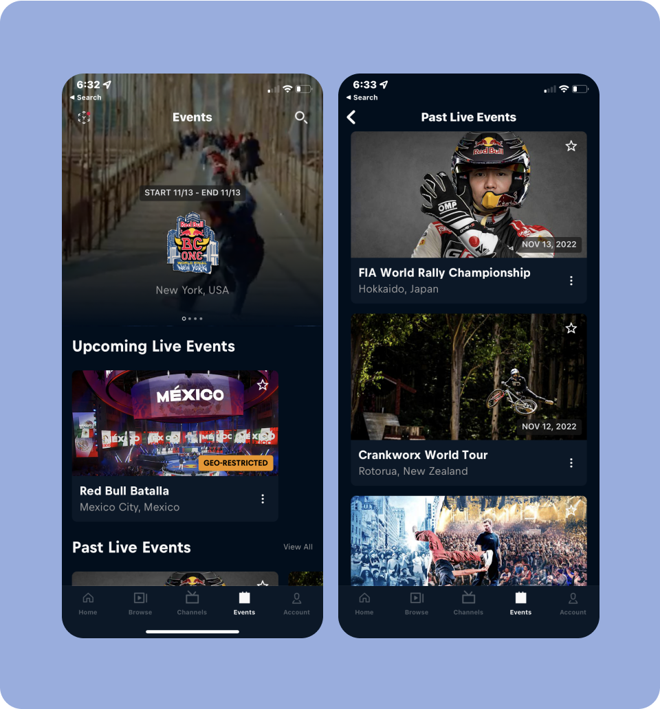
Events not categorized
Most testers were frustrated that events were lumped together instead of by category.
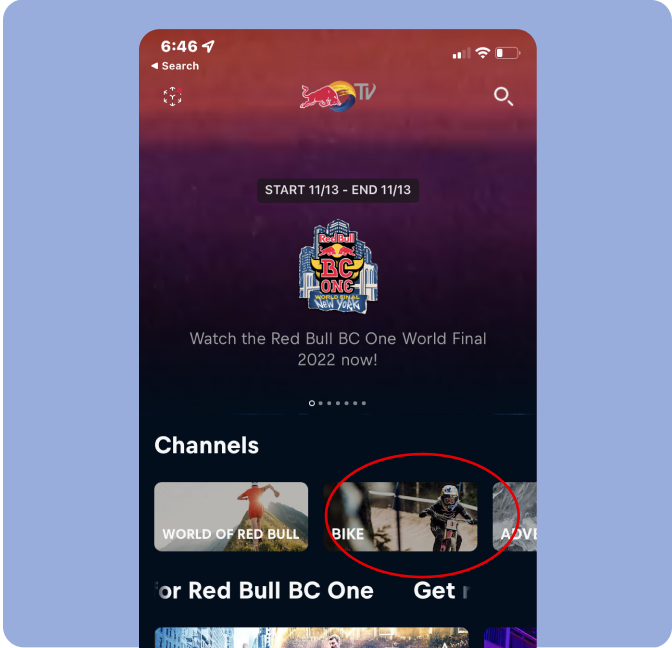
Confusing Channels Link
When tasked to find a live event, most testers said they expecting to find events in the channels link but instead found randomized live content.
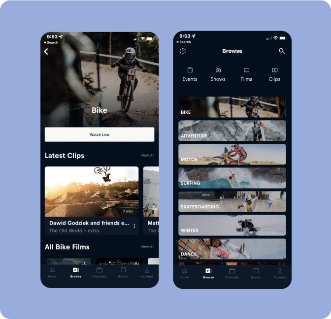
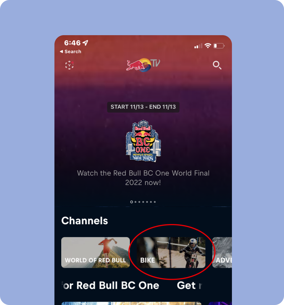
Browsing pages felt misleading
Some testers tried tapping ‘browse’>‘bike page’, however this page contained a variety of bike content but not bike events.
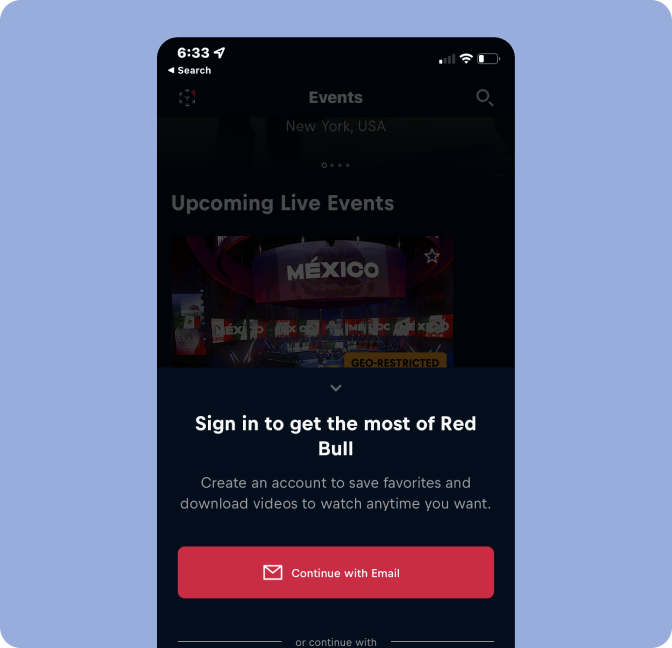
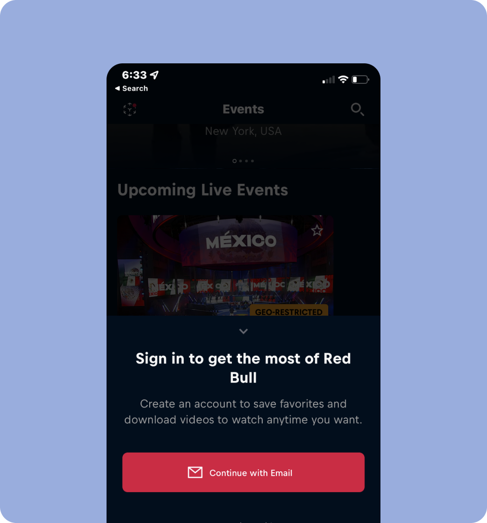
Logging in was a deterrent to favoriting content
Many testers abandoned favoriting after the login prompt. Consider onboarding users early for a seamless experience.
Other Key Insights from Testing
- 4 out of 5 users relied on the search bar due to poor navigation
- All participants loved athlete profiles and behind-the-scenes content
- Many found the homepage overwhelming and felt unclear about where to start